Branding Case Study | Hestrup Family Wellness

After 35 years in business, Dr. Bill and Debbie Hestrup were experiencing a plateau in their wellness company even though they had continued their efforts to grow and invest back in their business through extensive training in specialized areas.
Despite being one of the only chiropractors in the area trained in kinesiology and nutrition response testing, they were stuck using their old messaging and were disappointed they weren’t attracting the clients that were seeking these new types of services.

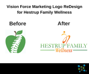
We saw the gap immediately. They were still using the same logo and as they had been – which was an apple with the ubiquitous spine that virtually every chiropractor has featured in his or her logo. The issue we saw was that Dr. Bill isn’t just another chiropractor, he has extensive training, over three decades of experience and is highly specialized in the activator technique. That combined with Kinesiology and nutrition response testing – it differentiated them, but no one knew.
After completing a few strategy sessions with them, it became clear they had outgrown their current brand, but they hadn’t changed their message to the marketplace. Their ideal client wasn’t the typical chiropractor patient looking for a one-time adjustment, rather their target market were individuals seeking out holistic medicine as an alternative to mainstream doctors and big pharma.
The first thing we did was to help them clarify who they were now and who they wanted to attract as patients. Once we were clear on their objectives, we scrapped the obvious spine and apple and designed something that reflected energy and healing – a logo that aligned with their vision and who they are as practitioners.
The Result
Since working with us they have broken through their plateau and what is even more impressive is they’ve been able to make the transition to a cash-only business. It’s very rare for a company who has been in business over 3 decades to be able to pivot and rebrand themselves and still continue to grow 20% year over year.
“Leah Hoppes & Sean Whitfield of VisionForce Marketing created our new Logo that provided a cohesiveness & excitement to our branding that reflects our passion of guiding our patients to “take back their health”. Also through the step-by-step coaching of Sean and the tools & framework that Leah took us through in creating with us our marketing plan — our business foundation is solid as to who our audience is, what our message is and how & where to reach our audience. We had decided to change our office to a new location (15 minutes away from our old office location) so Sean created our new website with the latest of technology and our patients all love it! We are able not only to capture new & potential patient names & emails but also provide our patients with the most up-to-date nutritional information as to what is ‘true health ‘ vs. what is a ‘fad’. Our practice is thriving and 90% of our business is all referrals from our patients. We are so grateful that we teamed up with Leah & Sean!”
Debbie Hestrup – Co-owner Hestrup Family Wellness
